In this tutorial, we'll create drawn elements, use design brushes, bring them into Photoshop, and merge them into a unique poster composition that feels hand-made, stylistically unified, and personalized. The techniques here are focused on creating an original artistic illustration. Let's see how this poster design was created.
Step 1
Let's get started reviewing how to create this "Draw" poster. Then first thing that we'll do is plan the size, contents, and colors. I made mine for an A3 size poster, which is 420 mm by 297 mm, or 4961px x 3508 px, set at 300 ppi. The advantage of creating it in a large size is the ability to later adapt it to a printable full-size posters, magazine illustrations, design clothing like t-shirts, or web design content. Whatever size you choose, keep in mind that I will be giving instructions based on an A3 canvas at 300 ppi.
The content will revolve around the theme of drawing, using various techniques: water coloring, doodling, and ink pen illustration. We'll draw the doodles using a regular marker and paper, and don't worry if your drawing skills are out of practice, I'll explain the process. The ink pen look is achieved mostly through the ink-like purple color and paint splatters.
As a color scheme, I started by choosing a neutral background color: e4c99f. Next up is the darker purple color that can add depth and contrast to the design: 2d3043. The second main color emerged from the background: e49549. So why two shades of orange and purple? Well you generally need a dark color that acts as a chromatic anchor. I chose purple simply because it resembles ink. There are plenty of colors you can choose with purple, like lime-green or yellow, but I wanted something that would add warmth.
Well, enough chatter, let's get our hands dirty! Create your canvas at an A3 size set to 300 dpi. Fill the background color with this color: e4c99f. I created a simple layout with dark lines.

Step 2
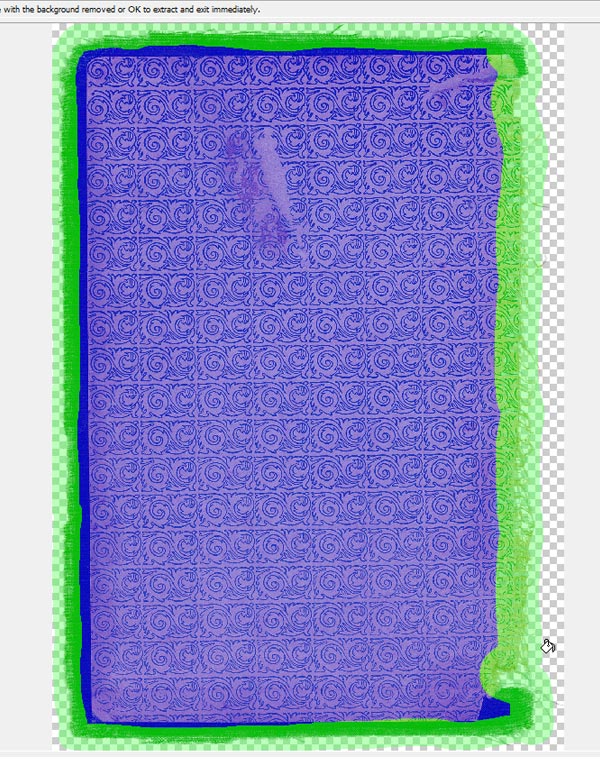
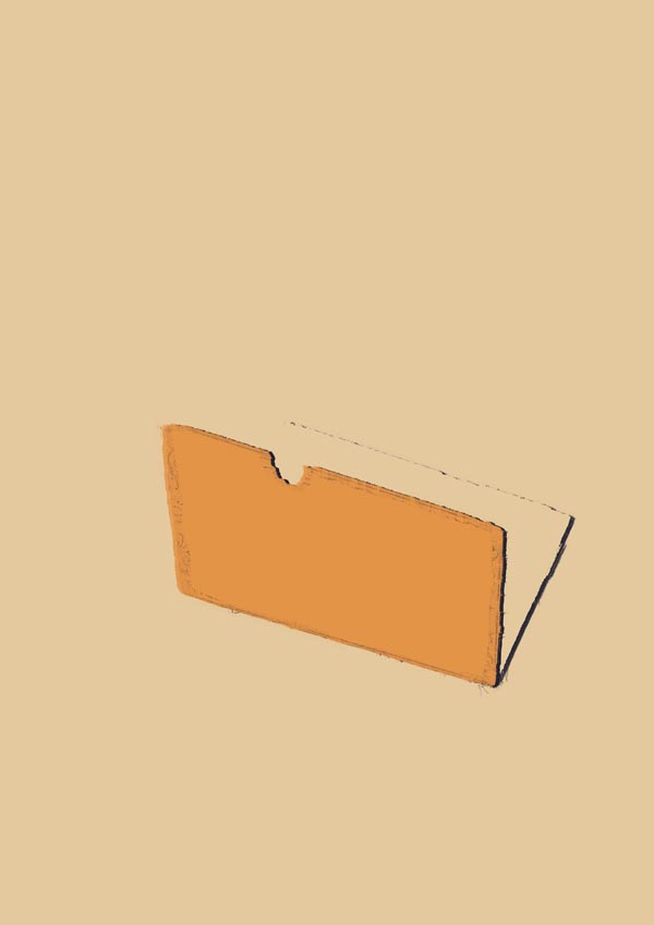
The first element that we'll create is a sketchbook. It will be barely noticeable and only suggestive. To create it, you'll need the two inner covers from this Bittbox freebie. Use number 3 and 10 in the download list. After you put in Photoshop, go to Filter > Extract, and paint it accordingly in order to cut it out. Use a large enough brush size that will preserve the threads.
Step 3
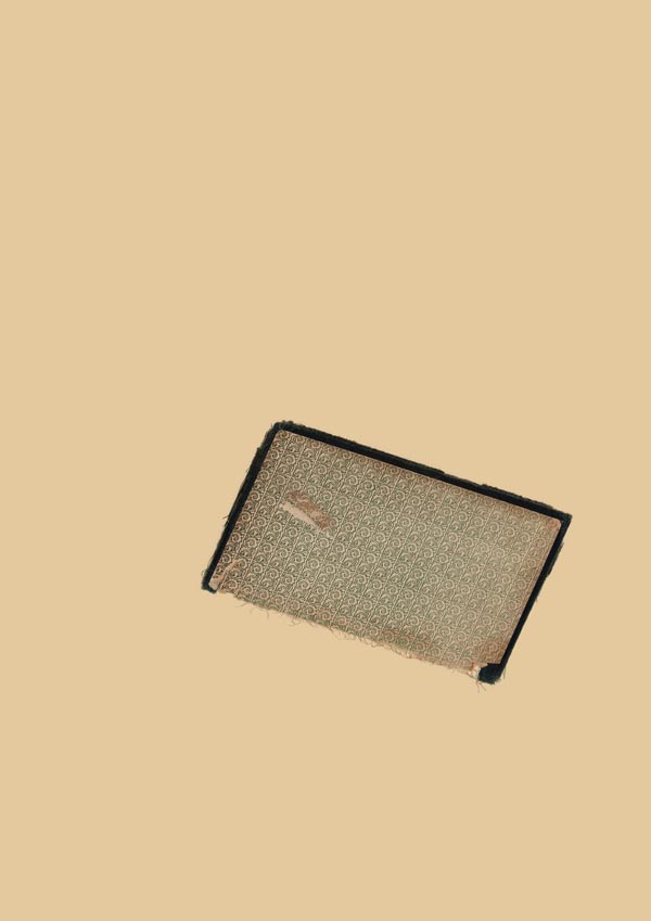
After extracting it, press Command + T to transform it and skew into its new position.
Step 4
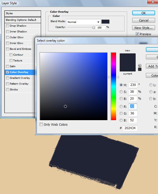
Double click on its layer to add a layer style. Add a Color Overlay and select a shade of purple.
Step 5
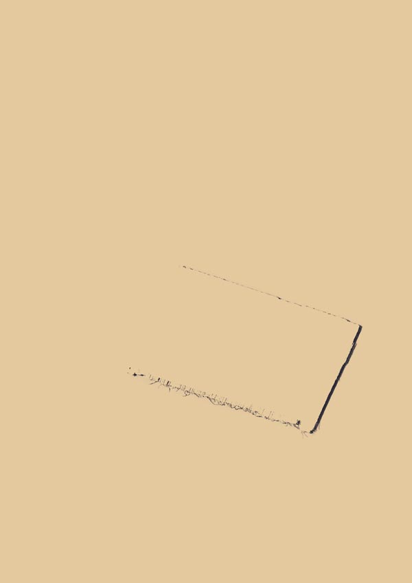
Duplicate the layer (Command + J) and move it slightly in order to give the cover thickness. Change its color to the background color.
Step 6
Repeat the same process with the second photo, except change the outer cover's color to our orange.
Step 7
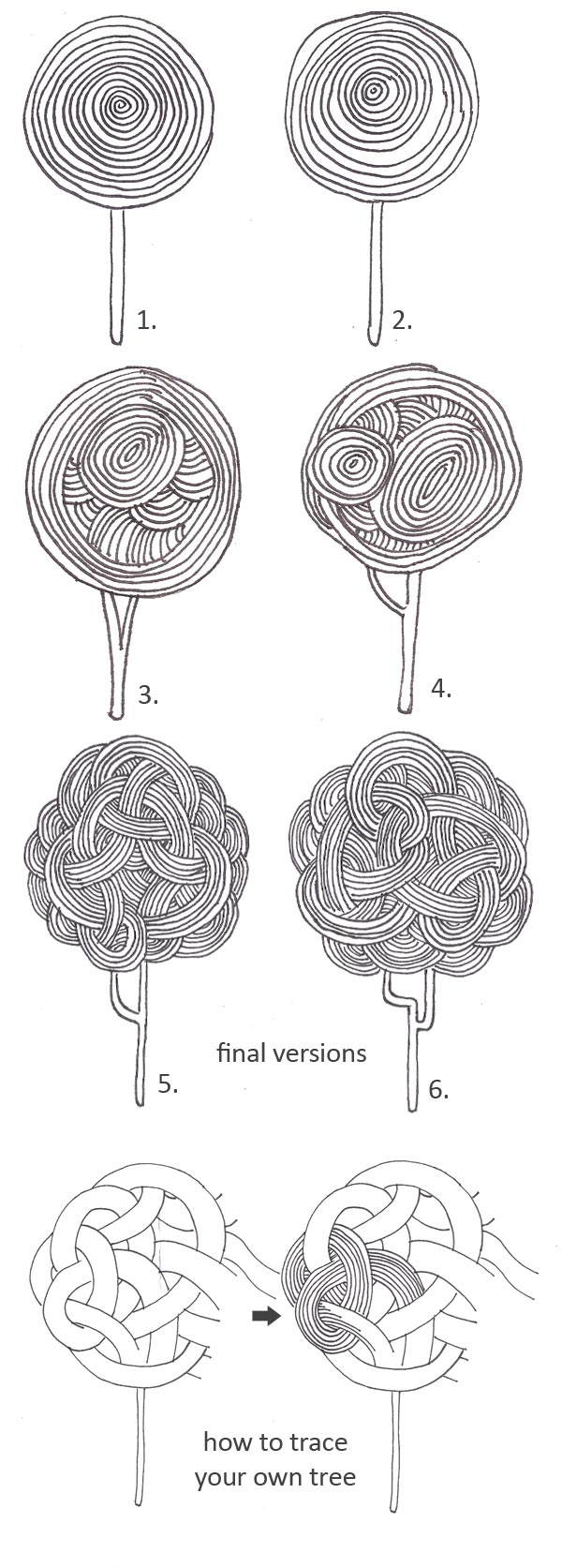
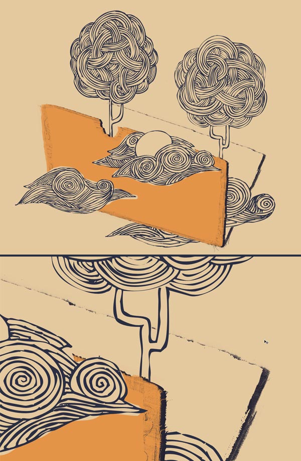
It's time for some doodling 101. Below is an image of how I created the trees. My personal tip is to start off by making small steps. Create simplistic shapes and observe what features you like or dislike. From the very start, I decided that my trees should be overly simple on the bottom, complex on top, and that they would simply be an illustration, not a representation. It's a more a caricature of a tree, than an actual sketch.
So go ahead and grab a pen and piece of paper. I used an Ultra Fine Point Sharpie Marker, which works great on standard Xerox paper. I didn't use rough paper, because I wanted the line edges to be soft. You might want to try doing that as well. Once you created your trees, scan them and insert them in a separate Photoshop project.
Note: When drawing, keep in mind the fact the elements need to be proportionally balanced in size.
Step 8
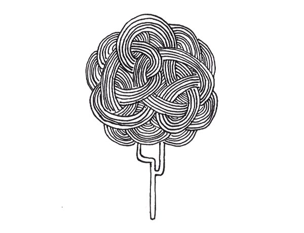
Put the new tree on the top layer in your file and create a white background one a layer underneath. Once you have the scanned tree in a layer, duplicate it (Command + J) and set the layer's blending mode to multiply. That will darken it.
Step 9
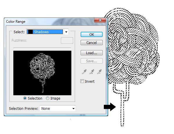
Go to Select > Color Range, and in the drop down menu select Shadows. This will select only the black from the image.
Step 10
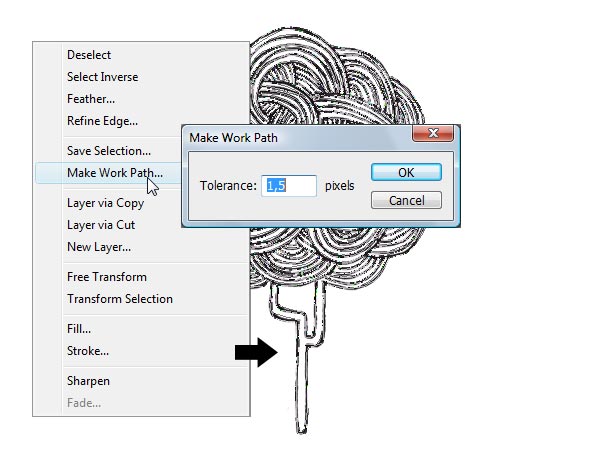
After making the selection, right click inside the canvas, while having the marquee tool active, then select Make Work Path. Input 1,5 pixels in the following menu. Fewer pixels will get you a more harsh result, and more will smooth and straighten the lines. Try to find a balance, as too many pixels will make the art too geometric.
Step 11
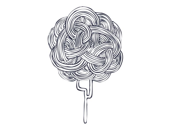
Go to Layer > New fill layer > Solid Color, and fill the selection with our purple.
Quick Tip
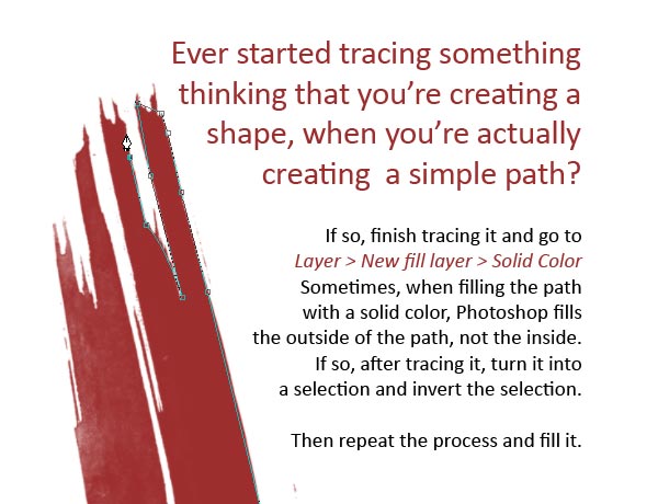
I've often started tracing something with the pen tool thinking that I was creating a shape, though I was actually in path mode. In case this happens to you, there is a way to get out of it. Finish tracing it and go to Layer > New fill layer > Solid color. Select a color and you have a vector shape. However, sometimes when you try to fill it, Photoshop will fill the outside and not the inside.
To correct this, after tracing it in path mode, right-click in the canvas while having the marquee tool selected and go to "Make Selection" You'll notice that the selection is inverted. So just press Command + Shift + I to invert the selection. After that, turn it back into a path and fill it.
Step 12
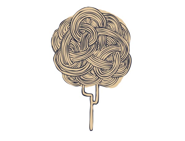
Let's get back to our tree. We need to create its background. All we have now is the outline. So get the "Pen Tool" and start making a background for it. Because of the style, I wouldn't be too careful on tracing it exactly. Fill it with the pale orange background color in your project. That's it.
Step 13
Now that you know the technique, you can make another tree (or more) and some clouds. Play around with the layout, but try not to overlay elements that weren't drawn together (touching each other in the actual doodle). And avoid clutter. Keep the design spaced out with enough white space to give it room to breathe.
Note: Keep the width of the elements similar. Enlarge or shrink elements proportionally and all together, otherwise you'll get different types of line thickness. You want them all to have the same line thickness.
Step 14
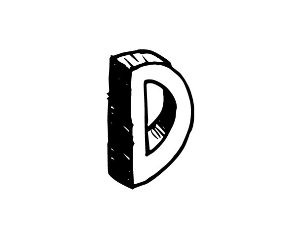
At this point, we'll add the text. Download this font: Refuse. Type in the letter "D" in your project. Make sure it's on the top layer (above everything). Under this layer, create a new layer and fill the entire canvas with white.
Step 15
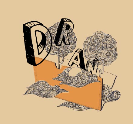
Position the newly typed letters in your design. Simulate depth by enlarging several letters. Avoid symmetrical pairing by grouping letters in 2-2 or 3-3 format. I put mine in 2-1-1, which gives a more dynamic feel. Slight slants are welcome, but don't exaggerate - remember the fact that this is a somewhat stationary scene, so the letters need to look like they are floating. To see an arrangement of letters that simulates rapid movement, see the fourth version in my Behance "Draw" series, entitled "Color".
Step 16
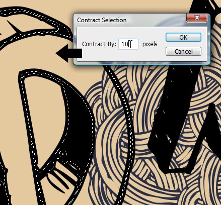
Go to the "D" Letter and Command + Click on its layer icon to select it with the Marquee tool. After doing so, go to Select > Modify > Contract. Now this is the tricky part. We have to get the thickness of the outline to match the thickness of the tree and cloud lines. Contract the selection thinking that the marquee you are seeing will be the actual thickness of the outline. I contracted mine by 10 pixels, because that was how I got it to match the tree.
Step 17
Right-click in the canvas, while having the Marquee tool selected, then press Make work path and use 1,5 pixels.

Step 18
So far, we've vectorized it in the same technique as the tree with a minor adjustment on the thickness. It's time to do something a little different again. Use the Direct Selection tool (A) to delete parts of the newly created path that resemble holes. You may choose to leave some in if you like, as i did, but Delete the small holes.
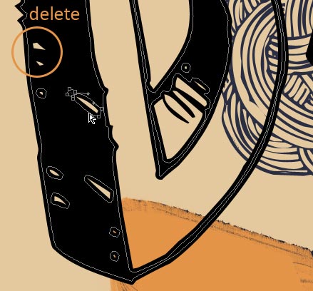
Step 19
As soon as you clean up the path, go to Layer > New fill layer > Solid color.
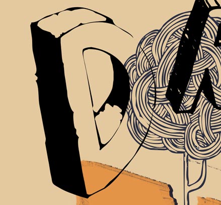
Step 20
Grab the Pen tool and trace the background of the letter. Also, change the outline's color to the pale orange and newly traced background shape to purple. This gives a more unique effect, being inverted. Once again, be intentionally inaccurate, but don't exaggerate.
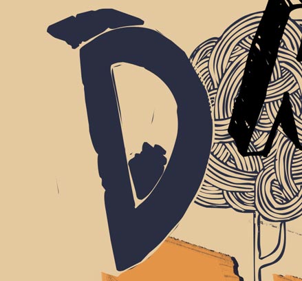
Step 21
Repeat the same process with every letter, constantly adjusting how much you are contracting the marquee selection to the current thickness of the trees and clouds.
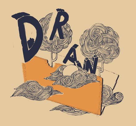
Step 22
Now it's time to have some fun with bittbox' freebie brushes. Download these brush sets: Watercolor, Watercolor II and Grungy Watercolor. Start by adding the background watercolor. Use our purple color and keep track of your layout! (Remember Step 1).
A Few Tips on Using the Brushes
- Take your time, and don't click away chaotically.
- Create every water color stain on an individual layer.
- After painting all of them, review every layer, checking if it's existence is, in fact, necessary (alter visible / invisible to help decide). You may notice that certain stains aren't even visible anymore, and are actually darkening the ones on top of them. Try changing colors at an individual basis in search of better chromatic harmony (Add a layer style: Color Overlay).
- Too many stains will clutter. Too few will give the impression that the design is too flat, or fragmented.
- Color balance is crucial. Avoid pairing too many stains of the same color. Create variation through contrast.
- Limit your number of colors. Keep small vector shapes with assigned colors in the corner of your screen that you can swatch at any time. The brushes themselves will already change their intensity because of what is under, or on top of them and because they vary in opacity.
- When creating a new stain, paint it in the center of the canvas. Then position it in its desired location by rotating it. When moving it around, make sure to do it while in Free Transform Mode (Command + T), that way you see its boundaries, even though you are not rescaling it in any way.
- More splatters equal more movement, so determine how much motion you want to suggest.
- Find the best ends on the elongated water color stains. Try flipping them after they are positioned.
- Keep your grid at hand, and check if you're still in the safe zone.
- Try creating a slant, for a dynamic effect. For instance my layout has a slight slant on the left side, suggesting that the elements are rising.
- Paint stains and ink splatters may look like the result of a spontaneous craze, but actually require precise positioning and careful reasoning. Each mark needs to contribute to the concept, otherwise it shouldn't be there.
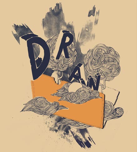
Step 23
Add some more purple and start adding orange.
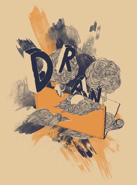
Step 24
Continue adding some orange and even a few strokes of darker orange: c6592e.
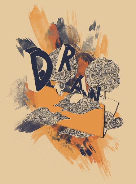
Step 25
Now let's add splatters. Download this pack, again from the wonderful Bittbox freebie collection: Splatters. Start by creating the illusion that the ink on the letters is being splattered onto the canvas. To add depth to the splatter, first place one normal splatter on one layer. Duplicate it so that it has a stronger color and opacity (however many times necessary). Then select the first layer that you created and scale it down.
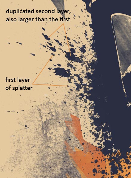
Step 26
Start adding the splatter creatively. Keep them splattering toward the exterior.
Step 27
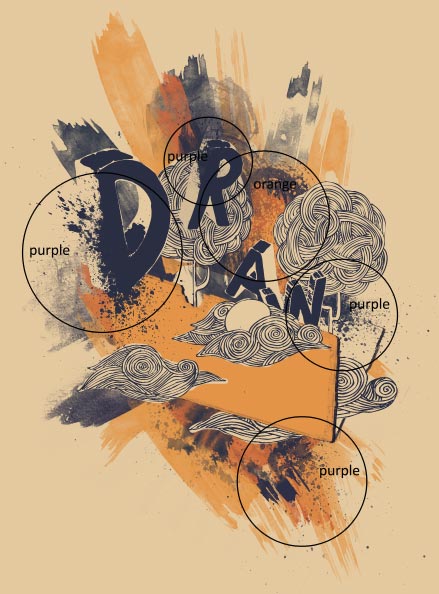
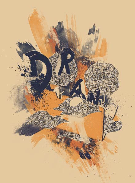
More Splattering, but this time using the background color (pale orange) and from the outside in.
Step 28
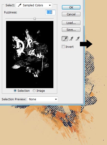
Almost there! The image still needs a little more depth. Select the purple you're using as the foreground color and go to Select > Color Range. Use fuzziness to your discretion or follow my 120 amount, and press Enter. You should get a selection of the purple in the entire image.
Step 29
Make a new layer and start painting lightly, with a darker shade of purple: 1b1d30. That should add the necessary contrast and depth.

Step 30
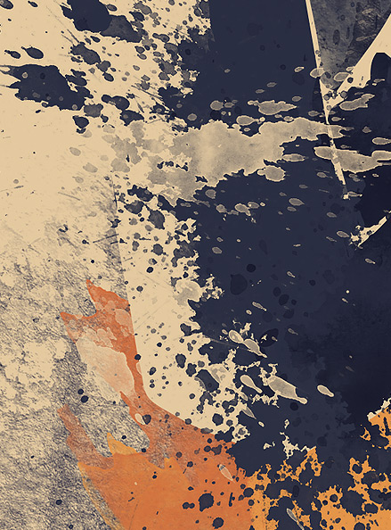
Zoom up, looking for any issues. Keep an eye out for splatters that fall outside the canvas area and soften accents that are too strong. Here is a close-up from mine. (Corner of letter "D").
Final Image
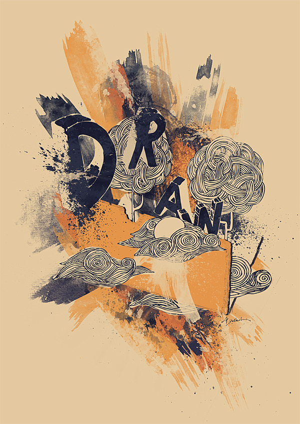
Well, we're finished! Hopefully, you've enjoyed this tutorial and found it inspiring and useful. Have a great day! You can view the final image below or view a larger version here.

0 comments:
Post a Comment