
How to Create a Movie Quality DVD Cover Photoshop Tutorial
Step 1
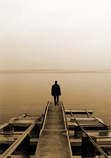
Create a new document with dimensions; 1000x1415px then go here and copy this image then paste it into your document and scale it to fit the full page.
Step 2
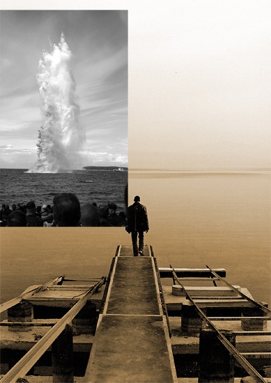
We're going to add a bit of disruption in the water so copy this image then paste it into your document then go Image>Adjustments>Desaturate then just scale an move the image until you have something that resembles the image shown below.
Step 3
Change the blend mode of this layer to overlay.
Step 4
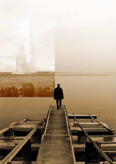
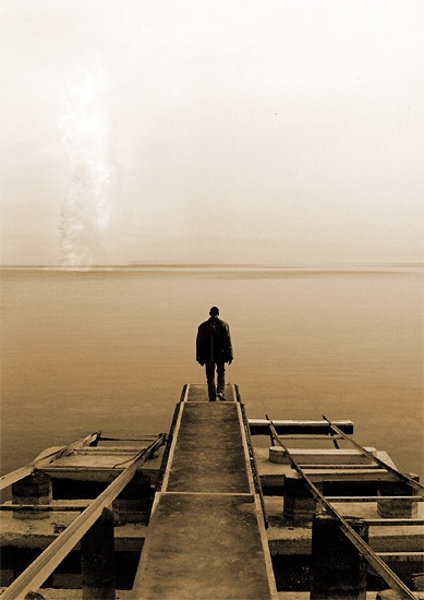
Obviously we don't want the peoples heads showing at the front and we want the sky and water to blend in. First add a layer mask to the layer with the explosion on it by clicking the layer mask button at the bottom of the layers panel. Select the brush tool and choose a 125px soft round brush then set the brush opacity to 20% in the main toolbar. Make sure the foreground color is set as black and the layer mask is selected. Now just brush around the parts that you want to hide so brush over the edges of the image first to soften them then over the people and brush over the water a bit to get it to blend. Keep brushing until you get something similar to the image below, if you feel you've brushed to much then just change the foreground color to white then that should unhide the parts that you now brush over.
Step 5
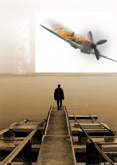
Now if you've already gone through part one of the tutorial then copy the layers from that tutorial straight into this document; if you have both documents open then you can just select all the layers from the plane document (except the background) and drag them into this document. If you haven't completed the previous tutorial then you can just use the undestroyed version of the plane which you can find here. Either way just scale and position it until you get something that you like.
Step 6
Now change the blend mode of the plane layer to multiply, if you followed the previous tutorial you may have already done this.
Step 7
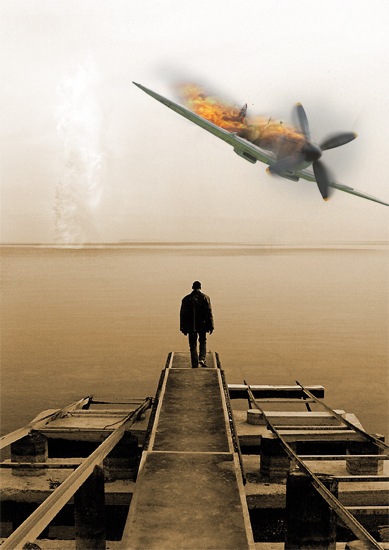
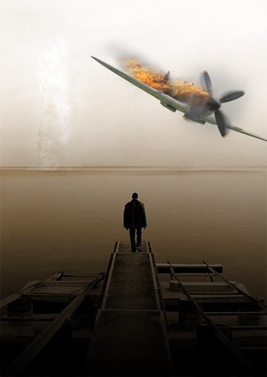
Change the foreground color to black then select the gradient tool then click the drop down arrow in the main toolbar and select the second gradient which should go from transparent to opaque black, if not then just make a custom gradient like this. Make sure the gradient type is set at linear then hold Shift and drag from the bottom of the document up to about the middle of the wing and you should get something like the image below.
Step 8
Change the blend mode of this layer to soft light.
Step 9
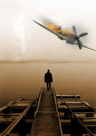
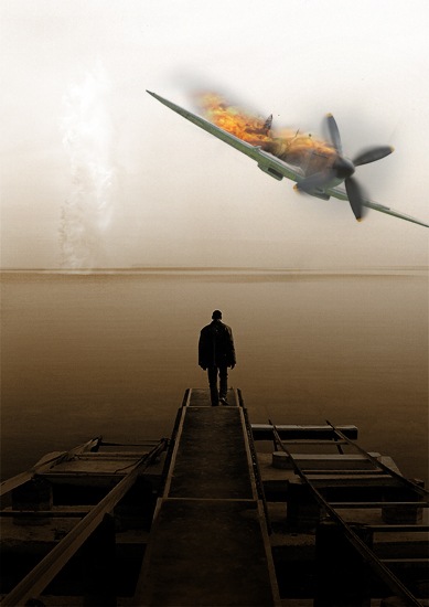
Duplicate this layer and change the opacity to 75% and the blend mode to multiply. We did it in this way so we can have the image fade to black at the bottom but still preserve the color saturation of the image; this is a good one to remember. We darkened the bottom of the image for two reasons; firstly to draw the focus away from the dock which stood out too much and secondly so we place our text here and it will stand out.
Step 10
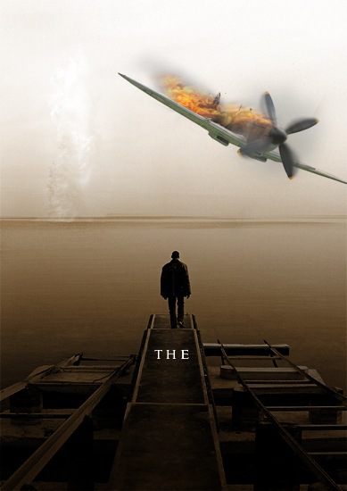
We're going to go for a really cliche movie font, Trajan; used on more than half of all movie posters since 2000. Trajan is overused but we're going to use it here because we're not aiming for originality anyway. Select the type tool then click somewhere in the document then type 'the' and change the size to 40pt, the font to Trajan/Trajan Pro and the color to white. Now move the text to just below the guy like in the image below.
Step 11
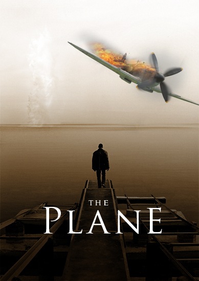
Now select the type tool again and click in the document then type 'PlanE' (note the uppercase/lowercase characters) and change the size to 180pt, I also changed the size of the 'E' to 170pt as it looked to big. The last thing that you need to do is to change the tracking (horizontal character spacing) of some of the letters to even it out. DO this by going Window>Character and highlighting one letter at a time and changing the tracking until it looks balanced and 'symmetrical'. Now move it to where it looks good.
Step 12
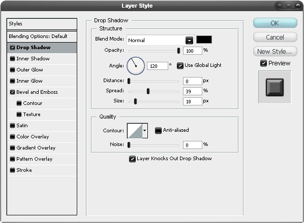
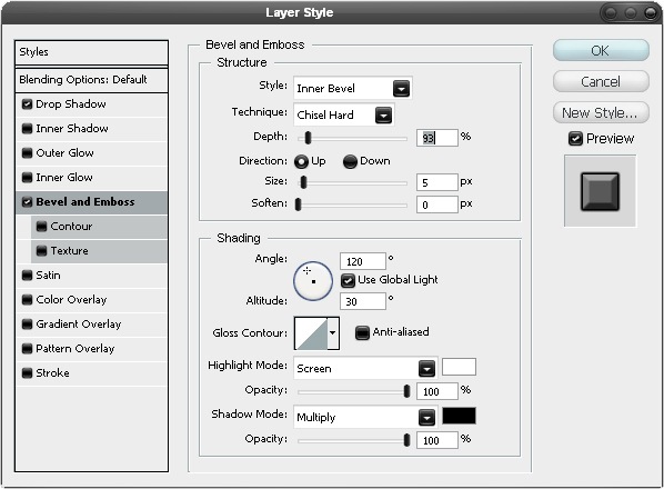
Right click on the plane text layer and go to blending options and add a drop shadow and an inner bevel using the settings shown below.
Step 13
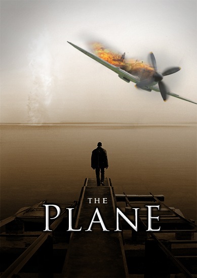
We want to add some soft vignetting now, which means darkening the edges of the image. You could do this with a gradient but here we're going to brush it on because we don't want it symmetrical and you have more control if you do it this way. So first create a new layer then grab a soft round brush with a size of about 150px and an opacity of about 10% then set the foreground color to black. Now just brush round the top corners (the bottom ones are dark enough) make sure you don't brush over the plane and keep doing this until your image resembles the one shown below.
Step 14
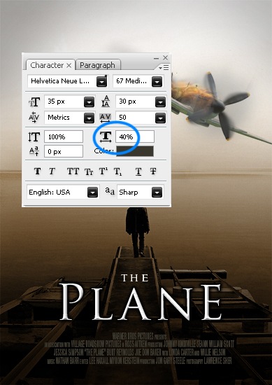
Most movie posters contain some credits and most of them use extremely compressed type. Basically here what you want to do is to type in your text and center justify it, it doesn't really matter what font you are using but set the color to something like #39362d. Now to compress it go Window>Character to bring up the character editor again then highlight the text and adjust the character width as shown in the image below.
Step 15
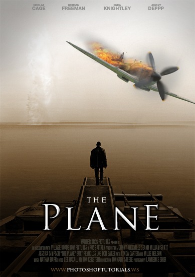
Now add some more text, I added the names of some actors at the top and a website at the bottom and just kept it pretty simple.
Step 16
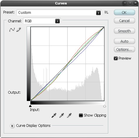
I added a curves adjustment layer by clicking the button at the bottom of the layers panel. Next just go through each channel and alter the curves slightly, the main thing I did was to lower the amount of blue in the image. Try to get your curves looking like the image shown below.
Step 17
I also felt the flames were not bright enough so I fixed this in two steps. First add a levels adjustment layer and drag the black slider in to about 35 and the white slider in to about 225; this will brighten our image a bit as well as raise the saturation.
![17[1] 17[1]](http://photoshoptutorials.ws/images/stories/17%5B1%5D_f3030d54-6bfe-444d-94bb-956a50f803c8.jpg)
Step 18
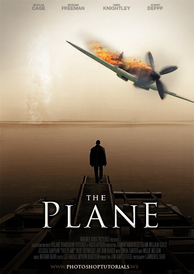
You'll notice that the flames look awesome now but the rest of the image is a bit off so we're now going to mask off the adjustment layer. This time hold Alt and click on the layer mask button in the layers panel and this will create a layer mask and fill it black so this adjustment layer is fully hidden now. Select the brush tool and choose a 30px soft round brush with an opacity of about 20% then set the foreground color to white. Now select the layer mask and just paint over the flames a few times and you will notice that when you paint over them they will become brighter as what we are doing is unhiding the adjustment layer in these parts.
Conclusion
To finish this tutorial off I thought I'd point you to a great PSD file of a DVD case, you can download it it here. What I did was saved my image as a jpeg then pasted the jpeg image into the DVD case document and this shows you roughly how the cover will look. This is optional but it's the kind of thing that would be useful if you were to present a DVD cover design to a client. You can see what mine looked like below
![20[1] 20[1]](http://photoshoptutorials.ws/images/stories/20%5B1%5D_8c152009-7942-4c8e-a701-2ae482c49657.jpg)
0 comments:
Post a Comment