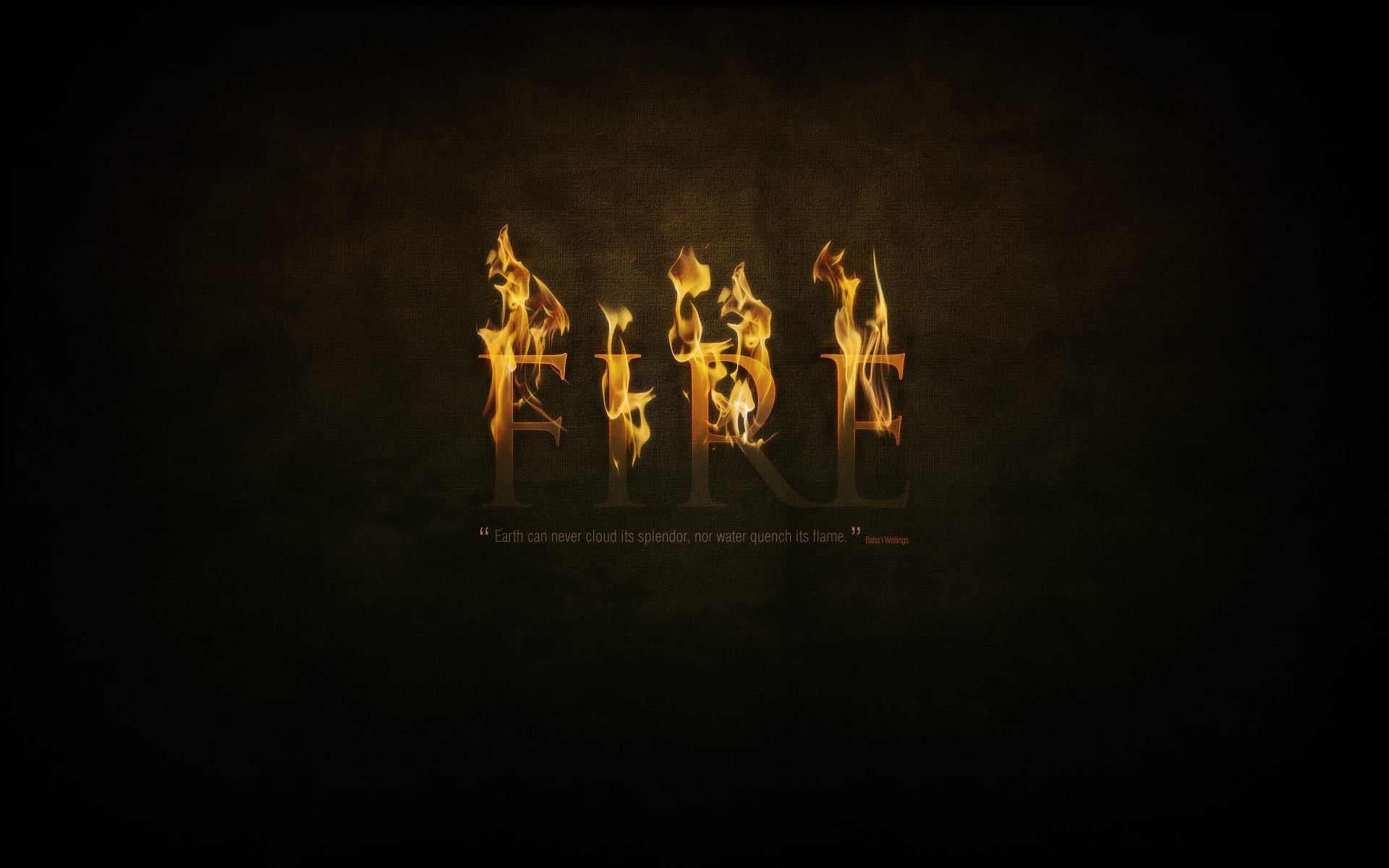
Flames are particularly hard to render in Photoshop, but in this tutorial I'll show you how to use a photograph of fire to set text to the match. We'll render the look on a nice dark background with a gorgeous text effect to complete the image.
The End Effect
Part 1—The Background
So create a new document in Photoshop at 1920px wide x 1200px high, and with the Gradient Tool (G), draw in a radial gradient of browns (#5c3d09 to #1f1409) so you get something like what is shown below.
Notice that the gradient is not centered vertically but sits toward the top. In this image we want the top of the text to be on fire, so the top part of the image should be a bit more lit up.

Step 2
As in the grass text tutorial, once again we're going to have a textured background. But rather than starting from scratch, I just copied the background from the previous tutorial, merged all the layers and desaturated to get what you see below.
If you need to make this from scratch, first visit Bittbox to get the original paper textures and then follow the previous tutorial's steps.

Step 3
Now we set the layer to Overlay and to blend the texture into the background and voila!

Step 4
Just to add a bit more texture though, let's run the Texturizer filter. To do this, create a new layer and fill it with a brown/beige color—#66500f. Then go to Filter > Texture > Texturizer and use the Canvas texture with 80% Scaling and Relief set to 4.

Step 5
Once you have your texturized layer, set that to Overlay. This adds some extra fine detail to our texture which is good because we're working on such a big canvas.

Step 6
Next we're going to apply a layer to slightly desaturate the bottom half of the image. This is so that the top looks like it has a warmer glow where the flames are, while the bottom looks a little colder.
So create a new layer and fill it with the color #4b4f3b. Then add a layer mask with a gradient to mask out the top and fade down (so you get the effect shown).
Now set the layer to Color and 45% Opacity.

Part 2—Text + Glow = Awesomeness
OK, we now have a nice background! So let's add some text. I've used the font Trajan because it's a really dramatic looking font. Here I've placed the text in the color #cb9328, then set it to Linear Dodge (Add) with an Opacity of 8%.
What we're going to be doing with our text is making it look like the top half of the text is coming out of the background and is red hot with flames flickering off. This means we're going to run a lot of effects and apply layer masks to them so that only the top half shows while the bottom half reverts to faded out text like we have currently.

Step 8
So first create a new layer group to put all the text layers in—because there will be a lot of them.
Then duplicate the text layer and set the color of the duplicate text to #5e3f1c.

Step 9
Now set the newest text layer to Overlay and 70% Opacity. It should look kind of reddish (as shown below).

Step 10
Now duplicate the text again and set the latest duplicate to a yellowish color—#cb9328. Then set this to Linear Dodge (Add) and Opacity 30%.
Next we add a layer mask and draw a gradient so the latest text layer fades out as shown below, and beneath you can see the reddish colored combination of the bottom two text layers.


Step 11
Next we duplicate the text layer yet again, but put this layer right on the bottom. Set the color to black—#000000. Then go to Filter > Blur > Gaussian Blur and it will ask you to rasterize the text, click yes to that, and then set the Radius to about 4px.
Then Ctrl-click any of the other text layers and go back to the black layer and hit delete so you are just left with a sort of shadow. Then duplicate this layer and merge it with the first so the effect is heavier. You should have something that looks like the screenshot below.

Step 12
Once again, add a layer mask so the shadow quickly fades out as shown. This makes it look like the text is coming out of the page.

Step 13
Now duplicate our black layer again and using the Smudge Tool (R) and a largish soft brush you want to just smudge the shadow around so it looks like burn marks.

Step 14
Here's how our text is looking now. I actually created two sets of "burn" marks, and then four sets of the shadow layer each blurred a little more than the last and each faded back.

Step 15
Now it's time to make the top part of our text glow. So first of all, duplicate the text layer again and place this layer at the very top and set it to a yellow color—#dc9a08.
Then run a Filter > Blur > Gaussian Blur over it with Radius of 8px. Then grab a large soft eraser brush and just erase away parts at the bottom so it's kind of uneven.

Step 16
Set our first glow layer to Soft Light. You might want to repeat the process, erasing even more so the top part is even glowier.

Step 17
Now duplicate the text layer yet again and place this at the very top. This one should be again the same yellow (#dc9a08).
Then go to Layer > Rasterize > Type and turn the text into a flat graphic. Then Ctrl-click the layer and go to Select > Modify > Contract and use a value of 1px. Then press Delete to delete everything except that 1px outline.

Step 18
Now set the 1px layer to Overlay, and you should have something like the image below.

Step 19
Now to our 1px glow add a layer mask to fade it out down the bottom as we've been doing with the other layers.
Then duplicate the layer, and run a Filter > Blur > Gaussian Blur set to 1px. Then duplicate this layer again and blur it by 2px. Then duplicate the layer again and blur it by 4px.
Then Ctrl-click any of the text layers, press Ctrl+Shift+I to inverse the selection and go through each of the glow layers and press Delete to remove any of the blur that has strayed out of the boundary of the text.
The idea is that we want the edges of the text to look red-hot with it fading in to an overall hot glow on the text.

Step 20
Next we duplicate all four of the glow layers and merge them together. This should result in a layer on top which is the original bright yellow.
Grab the Smudge Tool and run over the text, smudging it up to look like heat waves coming off the text, as shown.

Step 21
Now set this latest layer to Overlay and you should have something looking like this!

Step 22
Now we've pretty much finished our text. I went through and duplicated some of the glow layers to make it look even more fiery. Feel free to experiment with getting a real red-hot glow look by doing so.

Step 23
Next, in keeping with the last wallpaper, I've gone and added a quote underneath my main text. This provides a nice embellishment to the page. Try to use colors that fit in with the background and text layer so it doesn't stand out too much, because we really want this to be a secondary element to the main text. I've used Swiss Light Condensed as my font and laid it out just like in the previous Grass Text tutorial.

Part 3—The Flames
Finally, with all our preparation done, it's time to add the actual flames! For this, we need some images of fire set against a plain black background. A good photo is hard to find, and try as I did, I couldn't find a really great free photo. So in the end I used this photo from Fotolia which you can purchase using the link below. There was also an OK photo from Flickr which I've also linked to and which I ended up using later for the "E". So you might want to grab that too.
AcheroN—Fotolia.com
Peasap—Flickr.com
Now the technique for copying the flames over is actually really simple. I actually only learned this technique recently when reading one of Nik Ainley's tutorials for DigitalArts magazine called Create Amazing Photomontages where he did it with water.
What you need to do is:
- Open up the flame image in Photoshop
- Go to the Channels tab and find the channel with the highest contrast, which for images of fire should be the Red Channel, and click on it
- This will make your image appear black and white, and because we're on the highest contrast layer, it will seem really bright white. Now Ctrl-click this channel and it will select all the pixels in that channel.
- Click back to the RGB channel and copy the selected pixels
- You can now paste the flames into your main canvas!
This is actually a really, really useful technique for copying something translucent like fire off a flat background. And as you'll see by visiting Nik's tutorial, it's also great for copying water!


Step 25
OK, so here we've pasted the flames on to our main canvas. (For clarity I've also temporarily switched off the text layers). As you can see, we've got the fire without the black background and it's partially transparent, which means it'll look super on top of our text.

Step 26
Now the next thing to do is to cut up our one bit of fire into a few pieces. Just duplicate the layer and switch off one as a backup first. Then using the Pen Tool, cut up the fire so you work with the contours of the flame so it looks natural. Here you can see I've produced four pieces of flame from the one image. You can also try flipping bits around to make them seem more random.
Set the layers to Screen mode so that any remaining black parts are totally gone, and it's even more transparent.

Step 27
Now because my text is just four letters, I need four separate pieces of fire. For the fourth one (on top of the E) I actually grabbed that Flickr photo and repeated the same process as earlier to create another flame. Also the fire on the letter I has been squashed a little as well to make it look more random.

Step 28
Applying the fire is really as easy as moving the flames over the text. You want to try to match the flames to the shape of the letter so it looks like they are dancing off the letters.

Step 29
OK here I've placed all four bits of flame over the top. It's not bad, but you can see that the I and the R have the same flame and also all the flames aren't very tall.

Step 30
So here I've gone through each flame and using the Transform Tool stretched them vertically. Also I used a bit of judicious erasing to make the flame on the I look a little more unique.

Step 31
Now to make them look even more lit up, duplicate each flame layer, run a Filters > Blur > Gaussian Blur with a Radius of 3px and set the layer to 15% Opacity so it provides a bit of glow around the edges of the flames.

Step 32
So we're pretty much there! This is how the composition looks.

Step 33
Finally we'll add a last highlight. So create a new layer above all the others and draw in a white to black radial gradient as shown. Set this layer to Overlay and 40% Opacity.

Finished!
And there we have it, a text on fire effect! In the next tutorial in the series, we'll be producing the Air image, however it'll be in two weeks, not one—as I'm taking a few days off work!
If you're interested in creating flames from scratch in Photoshop, you might also like to check out this classic tutorial that coincidentally uses the exact same typeface! It's a Photoshop 6 tutorial, and I can still remember reading it like a half decade ago, but it's still very relevant, even if the screenshots feature a super retro Mac interface.


